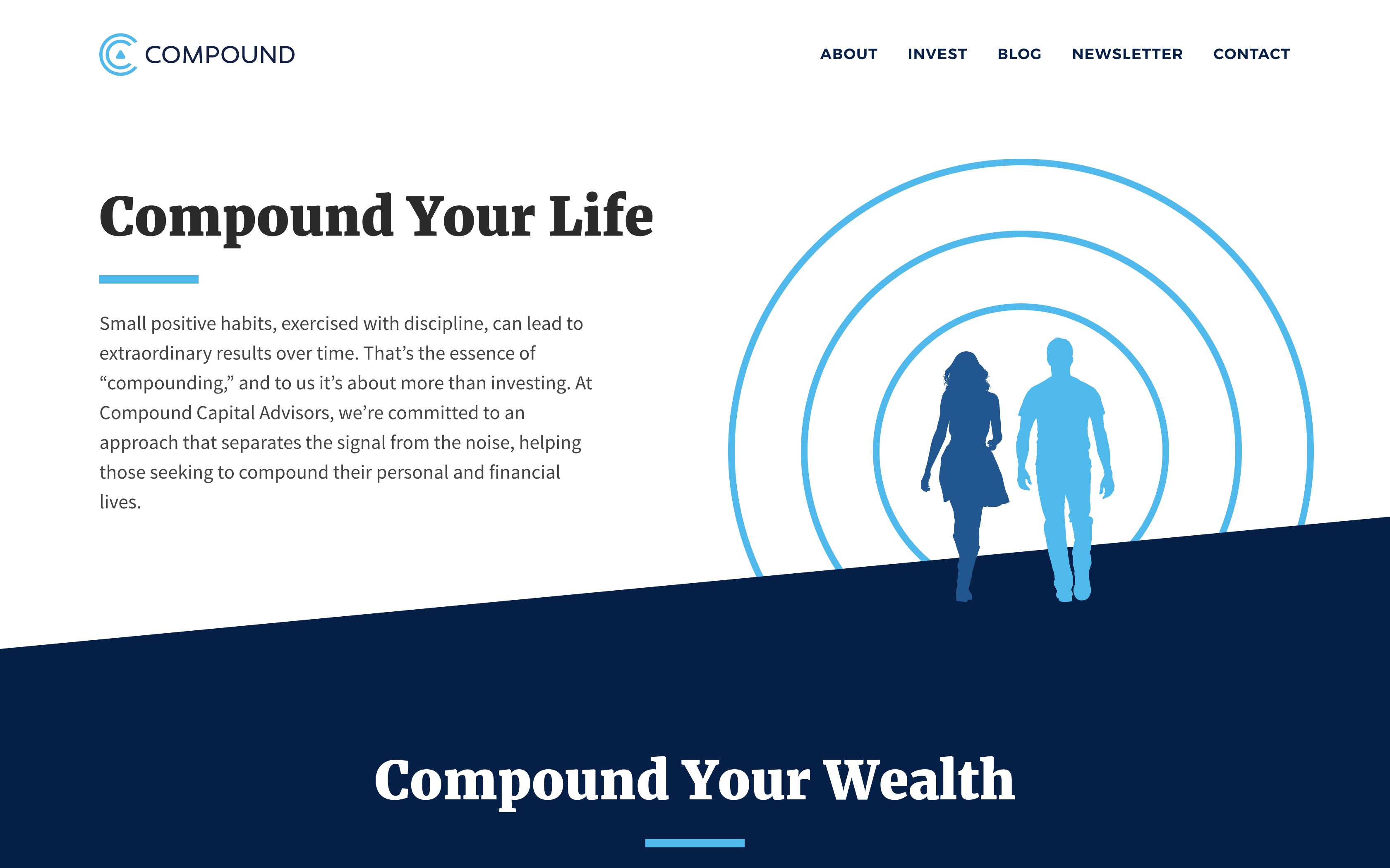
In the age of personal improvement and positive habits, Compound Advisors needed a website to convey their powerful message.
UI Library Design
Frontend Development
Backend Development

When Joe approached me to collaborate on the Compound Advisors website, he had already defined the brand identity.
What he needed from me was to transform this solid foundation into a versatile and practical toolset destined for the Web.
So I designed a UI Library comprising typography settings, color palettes, interactive elements, and much more. My goal was to satisfy the needs of standard online assets while leaving the possibility for this library to translate into more complex components.
One of the reasons why Joe approached me is because of my WordPress expertise. Ever since 2007, I‘ve been crafting 100% custom themes that I code from scratch.
I consider each of the websites I create to be unique, and to deserve its own personalized implementation.
That‘s why after having finalised the UI Library, I leveraged my coding experience to turn this library into an HTML and CSS framework around which I would focus the development of the Compound Advisors WordPress theme.
Since version 5, WordPress ships with a new enhanced editor: Gutenberg. We leveraged the power of this new tool to provide the blog authors with the best writing experience.
I built a custom React app that enhanced the built-in editor with our own custom Blocks and a unified visual identity. This allowed use to bridge the gap between the admin writing process and the frontend reader experience, giving the mantra “What You See Is What You Get“ all its meaning.
Combined with today‘s standard technologies (Webpack build process, Git versioning, Linux server configuration), I delivered a modern website that is fast to deploy, easy to update, and comfortable to read.
